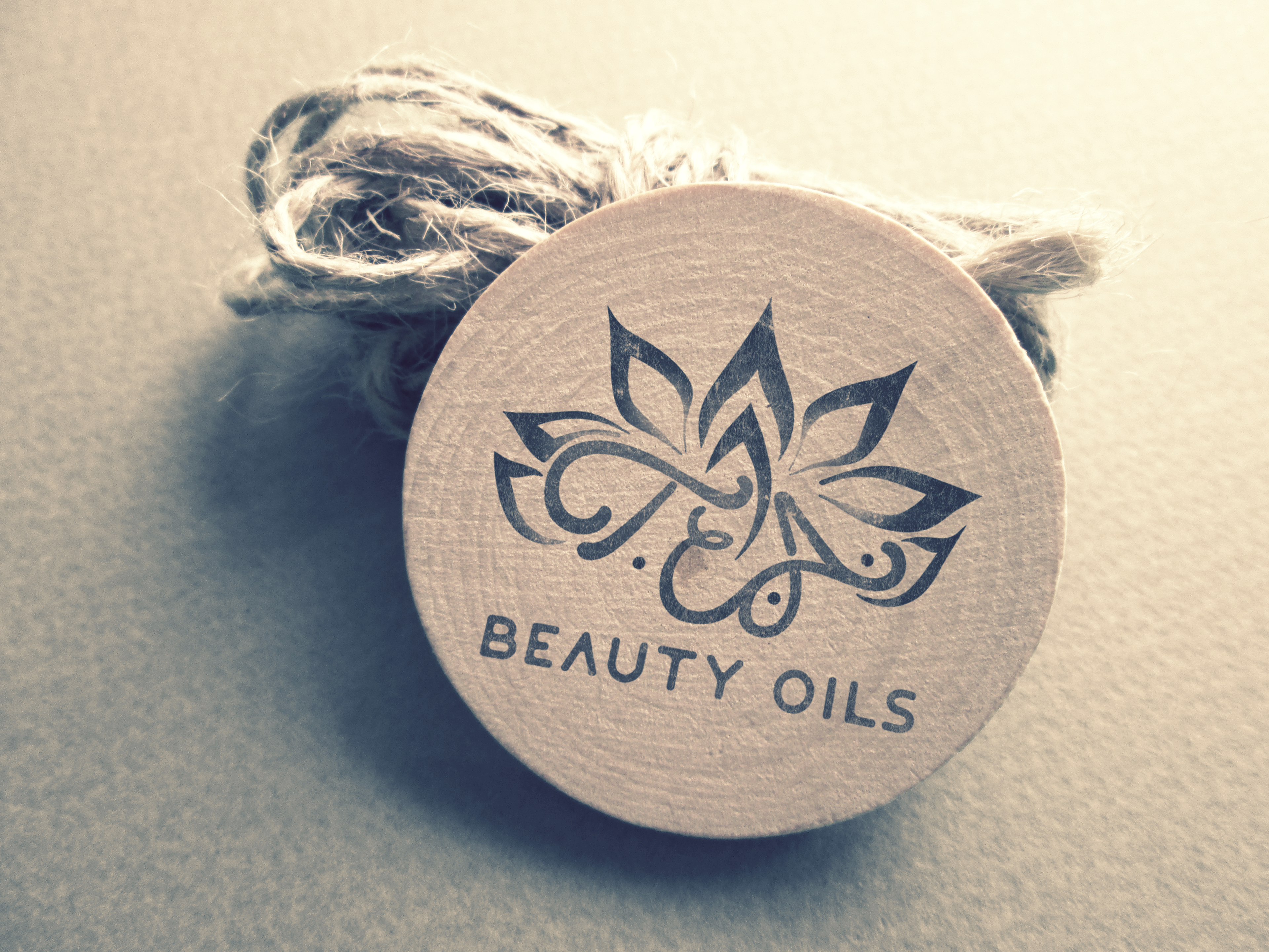
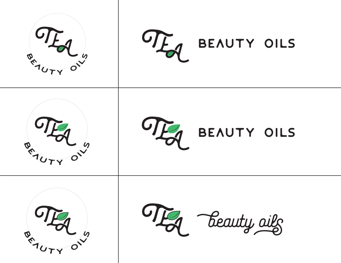
I was having lunch with a coworker and we were having casual conversation. I asked her if she had any side gigs she'd be willing to tell me about. She mentioned that she has been making organic cosmetic products for a couple of years. She mentioned that she needs to work on her branding. I offered my expertise on creating an identity for her cosmetics company. Initially, she wanted to utilize her initials with a subtle leaf included. I decided to work on a typography layout of her initials. Once I had a layout idea, I began searching for a typeface that would work best for the direction of the layout.

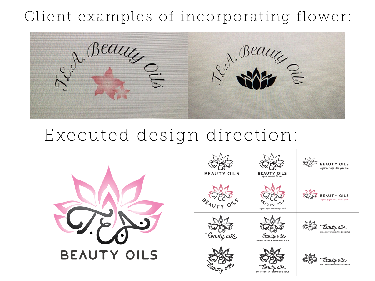
She then decided she wanted to incorporate a lotus flower along with her initials. I continued to sketch out ideas on how to illustrate the flower and utilize the typeface I selected. I determined that I would need to also design the lettering of her initials in order to unite the two elements. I ended up sticking with the original typeface I chose to utilize it for the 'BEAUTY OILS' heading.

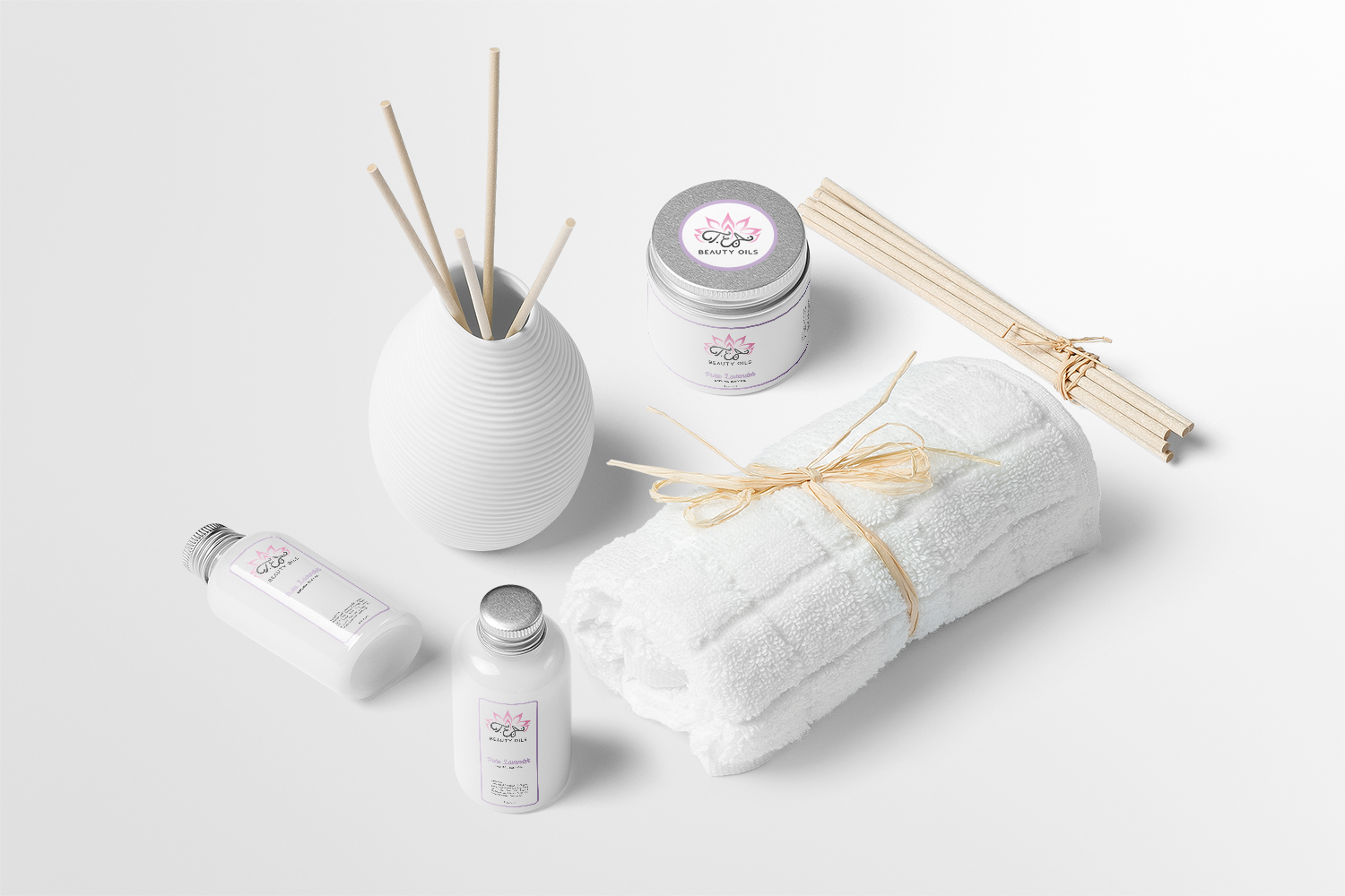
The client was pleased with the final design for her cosmetics identity. I had offered to also design some labeling for her products. Below was an option I had provided to her in the event she was ready to move forward with more branding needs. Overall, I enjoyed every aspect of the campaign. I was able to capture the direction she requested and the design definitely conveys it belongs in the beauty products aisle at the local grocery or pharmacy. You can find her organic beauty products here.