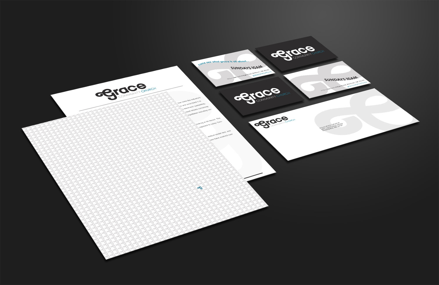

Identity campaign I worked on with the designated creative team for Grace Community Church of Ashburn, Virginia. I had the privilege of leading the team as the Creative Director. The campaign was a full identity refresh. We, as a team, decided to pursue a typographic identity direction. The campaign consisted of designing a new logo, stationary, a variety of collateral and marketing materials such as t-shirt designs and invitations. The ornamental accent of the 'G' presented the audience with a visual resemblance of the eternity symbol. The typeface selected also provided the ability to utilize the ornamental accent of the 'G' for background enhancements. The colors were specifically placed to provide a sense of understanding and curiosity, as the bold, dark 'grace' draws in the eye and captures the viewers interest to determine the other two portions of the church name, which are calming and inviting.